

Hey, so imagine you’ve got this tennis business, right? You know, juggling rackets, coaching, or maybe you’ve got some killer gear to sell. Anyway, your website’s like this big digital doorway. But here’s the kicker: if you wanna reel people in – meaning more sign-ups or sales – pointing them to your homepage is kinda like handing someone a racket and walking out the door. Yeah, not cool. This is where landing pages come in. Hang on, let’s break this down.
Now, landing pages – what’s the deal? Why should anyone care?
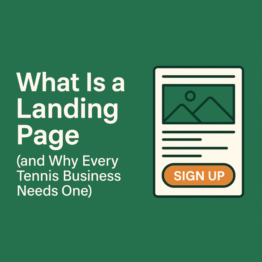
So, Landing Pages – What Are They?
OK, so a landing page is just this single, standalone web page. You make it for one reason only, like convincing someone to do that one thing.
What’s that thing? Could be:
- Signing up for a free lesson (who doesn’t love free stuff?)
- Booking a camp (summer’s coming, folks)
- Snagging a guide on tweaking your tennis moves
- Buying something cool (shiny new racket, anyone?)
- Joining the email crew for some sweet offers
A landing page doesn’t do distractions. It’s got this laser focus. Just a BAM! Call to Action button – things like “Book Now” or “Snatch Up that Guide!”
Picture It Like a Tennis Match
You wouldn’t toss a newbie onto a court buzzing with pros, would you? Nah, you’d guide them to the right spot with the right gear and pointers. Your landing page does that online. Zeros them in, no fluff.
Why They’re a Hit
Three seconds. Yep, that’s how long visitors take to love or leave your site. Seriously.
So, your landing page? Needs to:
- Hook them quick
- Be crystal clear
- Skip the fluff
Imagine someone’s searching “tennis summer camps nearby.” Bam, you hit them with a page shouting:
“Join Our 2025 Summer Tennis Camp in Miami! 4 Weeks of Fun for Ages 7–16. Hurry, Spots Zoom Out Fast! [Book Now]”
That page isn’t just gonna sit idle – unlike one cluttered with a hundred things.
Anatomy of a Killer Landing Page
Break it down. Here’s what you need:
- Big, Bold Headline: Make it obvious (“Summer Camp for Tennis Lovers” over “Welcome Here!”)
- Clear Subheadline: Back the headline up – benefits, not just features.
- Visuals: Show happy peeps or gear in action.
- What’s in It for Them: Be specific about benefits.
- Unmissable Call to Action: Let that button pop!
- Zero Distractions: No nav bar, no sidebar, nothing.
- Trusty Social Proof: Happy testimonials or cool ratings? Yes, please.
Oh, and You Don’t Need to Be a Tech Guru
You can craft landing pages without being a code wizard. Use stuff like HubSpot, Unbounce, or whatever clicks for you. Even WordPress with plugins can do the trick. Or, just holler at Resourcely Marketing. Copy, design, the whole shazam!
Pro Tip: Keep It Cohesive
If you have an ad saying “20% Off First Lesson,” your landing page better say the same. Trust me, nothing turns people off faster than a mismatch.
Forget About The Homepage for Serious Stuff
Your homepage? That’s for browsers just poking around. A landing page? It’s for the ones ready to leap! You’re running a promo, sending an email blast, or wanna grab leads? You need a landing page. That’s it.
And the awesome part? You can track all of it. See who clicks, who converts… a whole treasure trove of insight for smarter decisions.
Need a Hand with Landing Pages?
We’re here to make your next move spot-on. Hook up with us at Resourcely Marketing, and let’s get you a landing page that actually brings the goods – more sign-ups, more sales, and more smiles.


